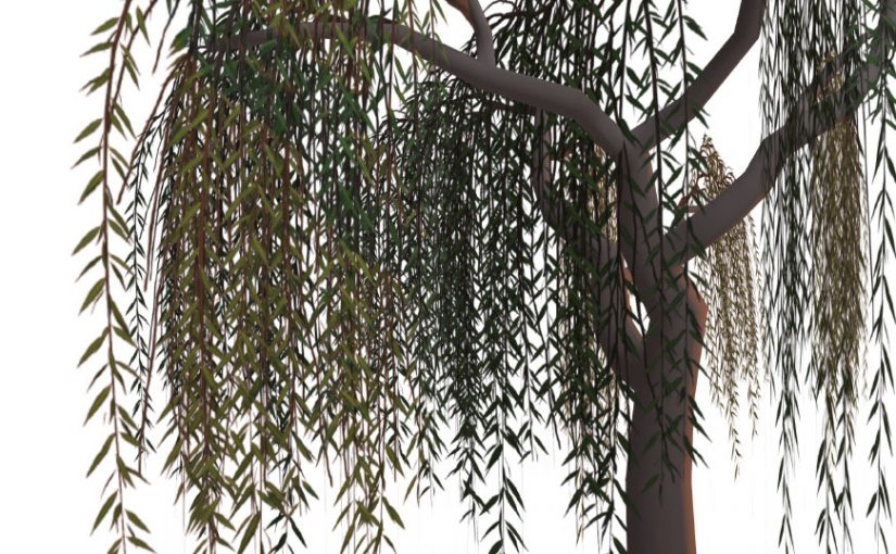
Last time, we left off with the start of some great foliage for our willow tree, but the placement overall was a bit sparse.
Today, we’ll look in to ways of bulking up the foliage so that it looks more healthy.
At this stage, the easiest way to develop a stronger silhouette from all angles is to consider the foliage as multiple pieces of a whole, each varying in size but as a whole ‘mounding’ or ‘padding’ in key areas.
There are a few different techniques available for the tree-making process, but because we’re dealing with a tree that has somewhat out-of-the-ordinary foliage, I’ve chosen to create planes of geometry which have been mapped to parts of a larger texture and to have each of these planes intersect at a common area, to simulate a branch.
Here, I’ve used much the same process as last time to create a variety of different foliage shapes based upon some underlying branch drawings.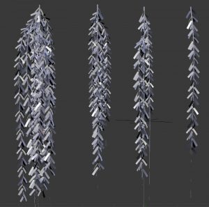
The same leaves and stems we used for the sideways texture are repurposed here, again with the help of bezier curves, which allow for non-destructive manipulation of geometry when a ‘curve’ modifier is added to the mesh object.
A gentle sweeping shape is added to the plane to simulate the slight upward growth, then strong downward plunge of foliage due to gravity. Once I have a shape I’m happy with, the geometry gets duplicated and resized, then I’ll take the geometry and map it to a different strand of foliage within the same UV map for some variety.
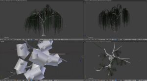
At this point, I split up my 3D view so that one view is using a rendered view and the other is solid or wireframe to properly place each piece so they intersect properly.
Once I have a cluster of this type of foliage that I’m happy with, it gets placed in strategic places where the other foliage type was lacking. It can also be helpful to hide the other foliage material temporarily to aid in clear placement.
It’s important to take multiple angles in to consideration here; while it’s not always possible for an object to look good from all angles, the goal here is to create visual interest through a play between areas where there are foliage and areas where there are not.
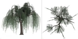
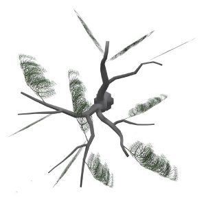
My immediate priority is to create an effective silhouette along the top surface of the tree. Then, I do the same working from a top-down view, taking care to create leaf cover in trunk/branch areas which are still bare.
It’s during this stage that some experimentation in balancing the different foliage geometry shapes is important. I started out using a variety of upright planes to create the impression of volume from the front view, but adding rounded foliage makes a big difference! There’s still a lot of push and pull to go, but this has come a long way compared to the tree we were left with by the end of last week’s post.
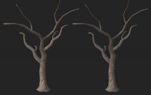
Also, you might notice that I got around to texturing the trunk; this was accomplished by importing a .OBJ copy of the trunk to Substance Painter and working with the tools therein.
I usually start with a base wood material, but never leave it as is. For one thing, Substance Painter still isn’t smart enough to figure out how to hide seams, and for another, I like to add a lot of little touches to make the look a little more unique.
In this case, I created another layer overtop of the wood and used a scratchy brush to create the deep furrows this tree’s bark tends to have. The brush included both a diffuse and height element so that I could give the impression of accumulated dirt and shadow, paying particular attention to seams and minimizing the tonal differences in these areas.
I then also made use of a particle brush to blow some dust and grime all over to add a bit more age and wear to the texture.
These textures were then exported using my usual PBR SpecGloss configuration (the default preset in the exporter) and added back to the model in Blender for one more rendering pass, since I wanted just a bit more kick than the plain textures would provide, given SL’s existing material shaders (somewhat limited).
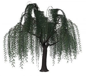 Moving forward, I’m likely to do a bit more balancing of foliage to make it a bit more subtle, but the basics are there.
Next week, I hope to have enough time to experiment with rigging & animations, plus consider the feasibility under current testing conditions.
If you found this or any other of my articles helpful, please consider becoming a Patron! Doing so supports further articles of this kind and my content creation in general. Alternatively, if you like the sorts of things that I make for Second Life, drop by my Marketplace listing or my in-world stores and check out what I have to offer!
Unless otherwise noted, I (Aki Shichiroji) and this blog are not sponsored in any way. My thoughts are my own and not indicative of endorsement by any associated or discussed product/service/company.
