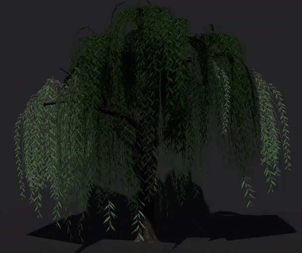
A small amount of downtime over the past couple of days has given me the opportunity to move forward with my Animesh Willow experiment.
At this point, I have to mention that this is all it is – an experiment. In the course of playing with animating a tree, I ran in to a number of hurdles which I’ll have to consider whether I want to get around before any possible release. (I’ll go in to these a little later).
From the hint that animesh might be a thing, I’d been thinking about using it for more efficient modelling of animated vegetation. Willows are the most obvious candidate for me, since I’ve long avoided creating more.
Original solutions for willows have historically included flexiprims and while these may still prove useful, I wanted to see what I could come up with that wouldn’t be so taxing on the viewer. The opportunity to create something that isn’t so heavily dependant on SL wind is also promising.
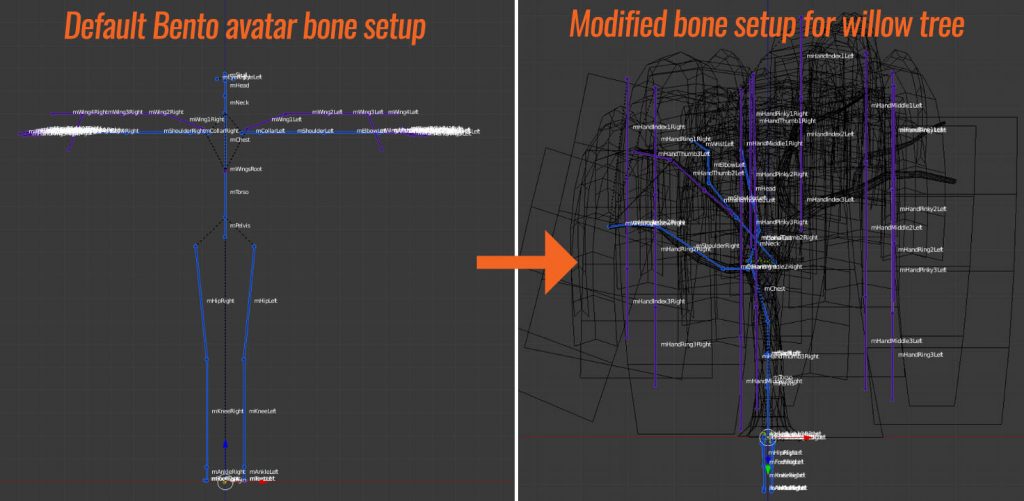
My willow tree armature required some significant modification of the default Bento avatar armature.
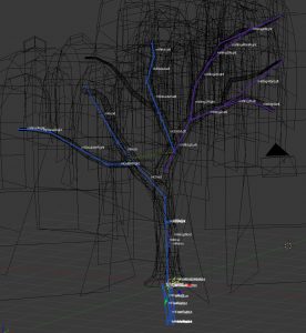
Currently, Avastar allows a user to select and move bone joints for either the blue/purple SL armature or green Control Bones in edit mode, then to align them to their counterparts. This is what I did and (so far) I haven’t needed to adjust any of the parenting for this rig.
I opted not to make use of the lower limbs (for now) because doing so can present some orientation issues due to how bones are parented. If i need to in the future, I may put in more time to figure this out, but in this particular use case, I chose to just use the bones from torso up, arms, hands, wings, neck and head (no face), simply because these would handle the geometry sufficiently.
The result is, in a very general sense, positive.
For the most part, the trunk was parented to bones which are logically closer to the middle of the skeleton. So it got torso, chest, collarbones, upper, lower arm, neck, head, etc. Most of the fingers got assigned to equidistant areas around the trunk for foliage.
In hindsight, I would probably rig and model concurrently. Because there was a significant amount of foliage geometry mixed together, selecting appropriate foliage and assigning it to its nearest bone was a bit tedious. Doing this a bit at a time to ensure proper movement would have been the better way to go.
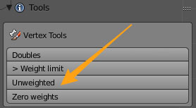
Fortunately, Avastar offers a means of checking for unweighted verts, so this process was made a bit easier as a result.
Weighting was undertaken mostly using the weight painting brush, but occasionally I would also hold down Ctrl while making my brush strokes to create a gradient of weights for my selected vertices.
Because there were so many vertices in relatively close proximity, I selected the bones I wanted in weight-painting mode, then hit ‘V’ to show vertices. I then selected the vertices I wanted to paint (rather than painting on everything) and brushed on only the areas highlighted by the selected vertices.
Animating the tree:
Once all of the vertices in the geometry were assigned, it was time to try some basic animation. So far, I’ve just put together a basic sway animation as a test case, but I may continue to create a variety of other animations the tree can play on command.
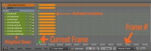
In order to create an animation, I split off a window pane in Blender and switch it to ‘Dope Sheet’ view. This gives me a frame-by-frame listing of bones for which location and/or rotation* has changed, over time (in frames). There are other more detailed and useful views you can use for animation, but this is the most basic view you’ll need right away.
(* Scale changes are ignored by SL, both on the armature and animation side.)
The Dopesheet operates mostly from left to right, although it does list off bones which have been weighted, on the left hand side as ‘channels’. When a bone is selected in 3D view, the appropriate channel will highlight in the Dopesheet view. On the flipside, you can also left-click the name of the bone in Dopesheet view to select the bone in 3D view.
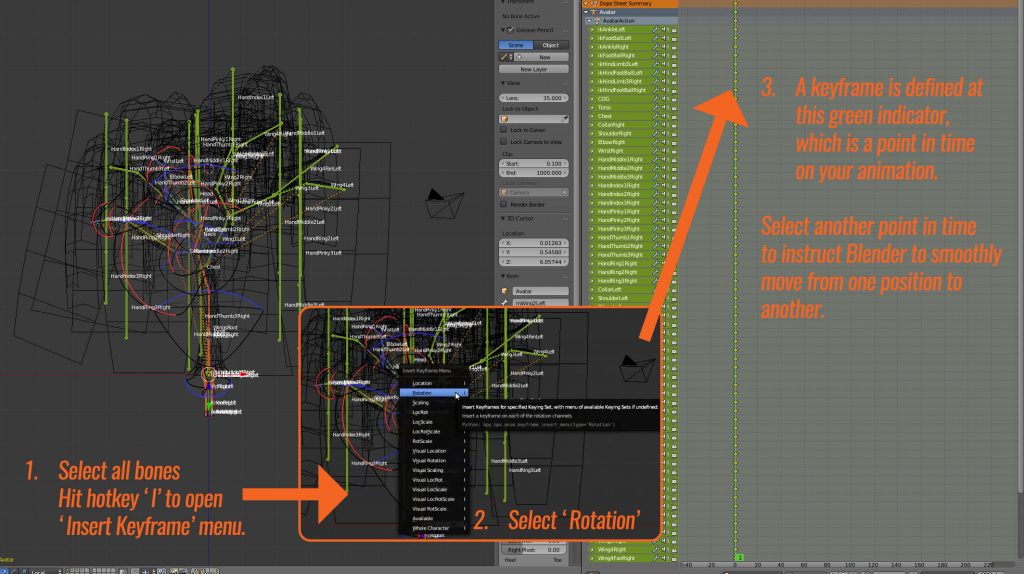
To animate, we need to ‘keyframe’ a set of changes in rotation and/or location and have Blender interpolate these transitions from keyframe to keyframe. In this case, the chief translations we need to make will be rotational.
To begin, I select every bone in the armature and keyframe the current rotation as a keyframe (Hotkey I, select ‘Rotation’). This will be my starting frame.
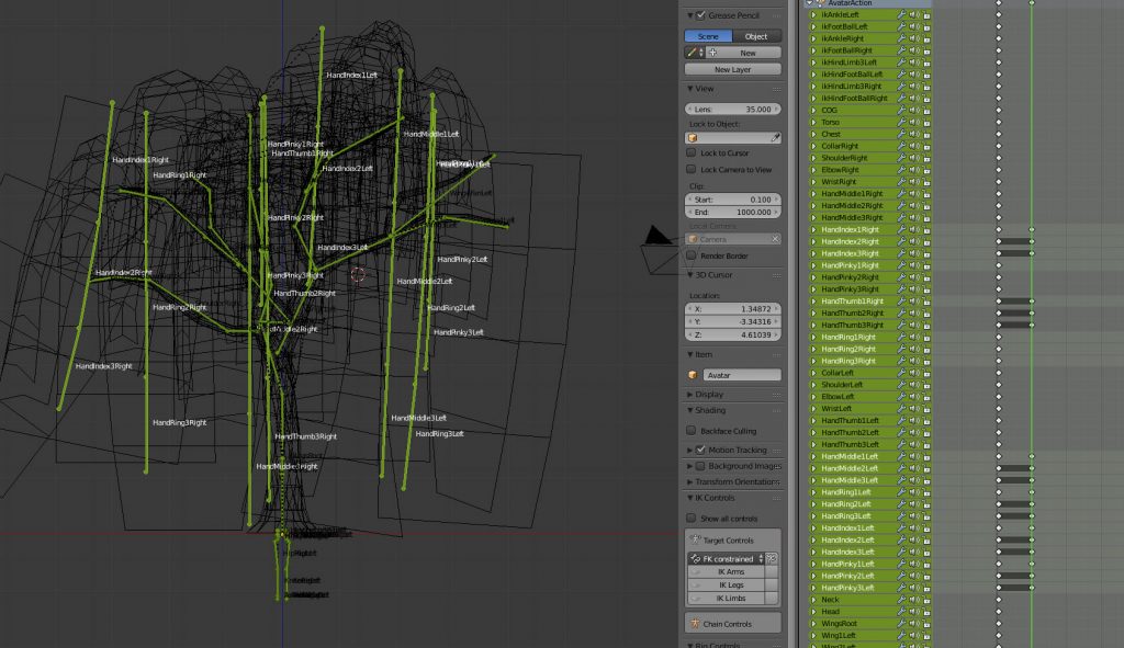
Next, we need to create the second position for the appropriate bones. Since I am only moving the hanging foliage, I select the appropriate bones (mostly just finger bones) and rotate them in the general direction I want.
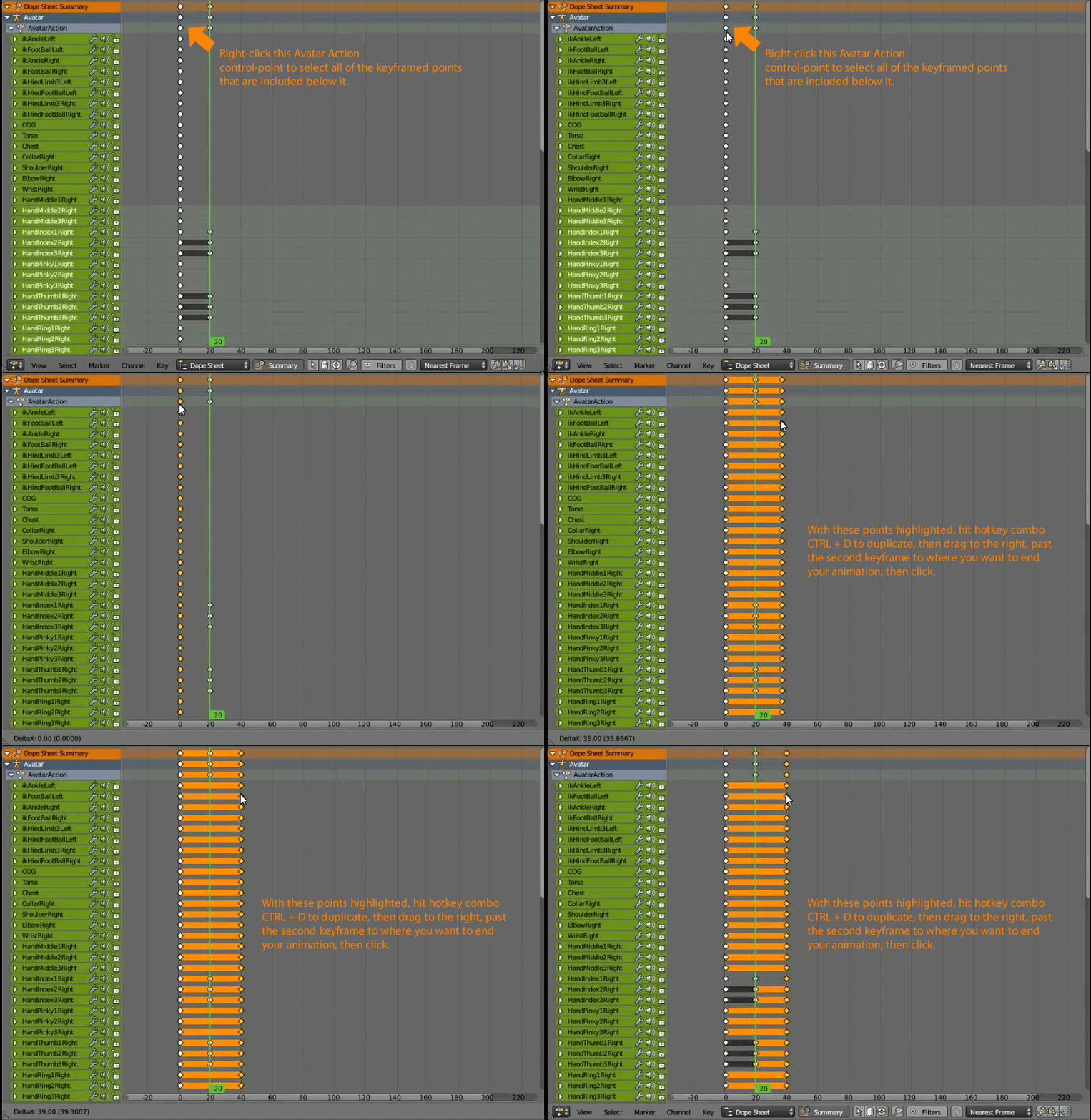
Then, since I just want to test and loop motion between these two keyframes, I select all of the points from the first keyframe, duplicate them and move them to where I want my end frame to go, allowing the animation to seamlessly move from the last frame to the first when it loops.
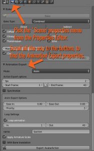
Next, we need to define our export settings to convert these keyframes to a full blown animation that can be used in Second Life.
Of note: Normally, frames per second (FPS) is set around 24. This particular animation has been slowed down significantly such that only two frames play per second, for a much more subtle effect. This can be played with depending on application – sometimes I will tinker with this to speed up or slow down walk-loops for avatars.
By default, I export .ANIM files instead of .BVH files – I don’t play much with the system morphs that come with .BVH and in this case, such morphs (system avatar-based facial expressions, hand gestures) are not applicable to this sort of content.
Once I have defined the start and end frame for the animation as well as the start and end frame for the loop (not always the same!), I click ‘Export: AvatarAction’ and save it with an appropriate file name.
In-world, I enable my willow as an ‘Animated Mesh’ object and drop the animation in to the mesh. Some additional scripts are needed to make use of this animation – some sample scripts to get you started can be found on the Animesh regions on ADITI grid currently. Hopefully we’ll see some more sample scripts on the wiki soon too.
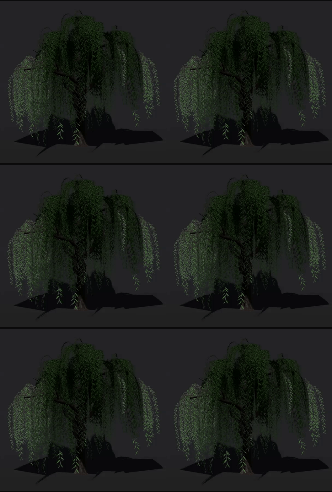
The result:
Current downsides:
- Animesh currently can’t be resized. They make use of the armature, where the size is defined upon upload. It may be necessary to create several different sizes for variety and, depending on application, special attention to scaled animations may be necessary as well.
- Transparent textures placed upon Animesh-enabled geometry currently do not cast a correct shadow.
- Base 200LI – this is likely to change for the better. Vir Linden has always maintained that the current 200LI base is boilerplate and mainly intended to be more restrictive than the ultimate release. Once I have a better idea of base cost, I’ll have a better idea of whether I’d like to move ahead with further LOD optimization and more detailed animations.
So for now, this willow will be on my backburner until we have more info from the weekly content creation meetings (Thursdays at 1PM SLT, Animesh 4 region on ADITI grid).
In any case, I wish you all a very Happy New Year!
I’ve had the fortune of being able to pick up more work in the past year and also the opportunity to present my thoughts and new releases with you lately here on the blog – I’m really looking forward to keeping the ball rolling in the coming year and hope to have more to share with you soon!
If you found this or any other of my articles helpful, please consider becoming a Patron! Doing so supports further articles of this kind and my content creation in general. Alternatively, if you like the sorts of things that I make for Second Life, drop by my Marketplace listing or my in-world stores and check out what I have to offer!
Unless otherwise noted, I (Aki Shichiroji) and this blog are not sponsored in any way. My thoughts are my own and not indicative of endorsement by any associated or discussed product/service/company.
