This week has been a bit of a mish-mash from a work perspective – not only is Candy Faire coming up but we’ve gotten a major go-ahead with a work project, as well as some additional requests that I’ll touch on later this month.
Today, I figured I’d discuss some techniques with regard to texture maps and how they can provide additional detail to your work.
The Advanced Lighting Model has been a part of the SL viewer for around five years, yet at this stage it’s still quite seldom that current content creators make use of it to its greatest extent.
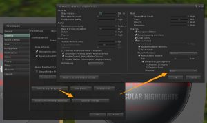
There is a common misconception that the Advanced Lighting Model is only usable if you can view shadows and projectors, but that’s not actually the case. The option to turn off shadows and projectors may be in a different spot depending on which viewer you use, but on the mainstream viewer, it’s located here:
So with that addressed, how can Advanced Lighting Model help us?
As I touched on during the last article, a major part of making more efficient content is finding ways to add detail without adding costly geometry, and a large part of that has to do with the texture map options provided by the ALM functionality.
What do all these texture maps do?
Diffuse (Texture tab)
Diffuse maps are the basic textures we use to give objects their flat colour. On their own, they do not provide any effect with regard to how shiny or bumpy an object may be, instead offering only a means to see colour on the object under diffuse lighting conditions (IE: no reflections or projections).

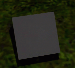
We might sometimes ‘bake in’ more details to a diffuse texture, but it’s important to note that these details will be static and not change with differing light conditions.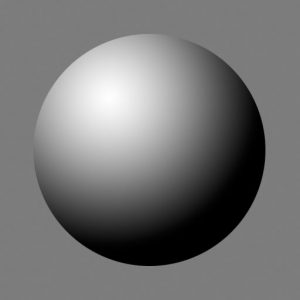
Normal maps (Bumpiness tab)
In SL, the Bumpiness tab uses ‘Normal’ maps, which tell the camera which angle each pixel should face and to what degree these pixels should recede or protrude. This shouldn’t be confused with bump or height maps, which use the monochrome spectrum to define distance of a given pixel from the camera – SL does use these to some degree, but not for the same purpose as one might expect.
Height maps become more commonly used when it comes to applications in SL where a strict height difference (and lack of angle info) is used – IE: Height maps for full regions – but I won’t be going in to that today.
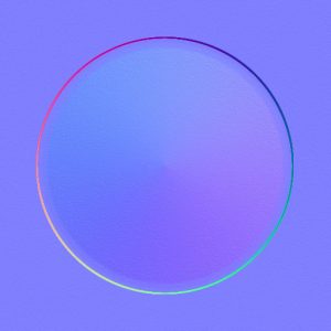
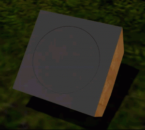
Under the right circumstances, a normal map can make a big difference between a flat plane and a flat plane with rounded buttons. Most commonly, the addition of normals is most noticeable when combined with Shiny maps.
Shininess (Specular)
Shiny maps are a combination of two different types of maps – Specular and Glossiness maps.
Specular maps control how much light gets bounced back from an object’s surface, as well as what colour that light would be. Glossy maps control how shiny or matte something is.
Combined, Glossy and Specular maps can control how matte or shiny something is as well as how diffuse or sharp the reflected highlight will be.
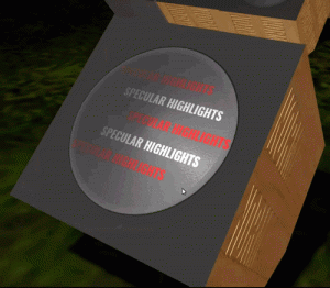
Adding Material maps to your workflow:
Creating your own bump/height maps using a graphics editor:
Height/Bump maps are created in greyscale. Of note, it is typically not enough to simply convert your diffuse texture to black & white, as not all lighter details on your diffuse texture are necessarily supposed to be closer to the camera, nor darker details necessarily supposed to be farther from the camera.

I usually start with 50% grey as a background layer, then use additional layers to create depth. Anything I want to recede gets a darker shade. Anything I want to come forward gets a lighter one.
Areas of higher contrast will see sharper bumps. Areas of lower contrast will be more subtle.
But Aki! You just got done telling us we usually don’t use height maps on objects!
While I did mention Normal maps are more commonly used within Second Life, the truth is most Normal maps are acquired by creating a height or bump-map, then having a program convert it for you.
Free:
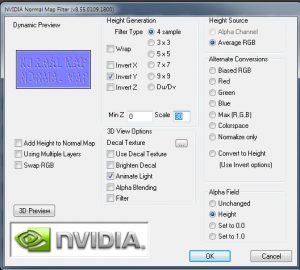
With Photoshop, you can use the NVIDIA Normal Map filter.
Just follow the installation instructions and you’ll find it under Filters in Photoshop the next time you load the program up. In it, you can control the scale of your normal map’s height, sample granularity and more, but usually those two (height and granularity) are all that I change.
Alternatively, there are a fair number of web-based converters with varying degrees of customization. Notably:
For pay:
There are a variety of additional programs that will do conversions for you, usually (but not always) bundled in with other functionality.
Crazybump – offers a variety of licenses depending on use. For selling in SL, expect to purchase the professional license.
Quixel Suite – offers a variety of licenses depending on use. For selling in SL, an Indie license is usually sufficient. Of note, this suite includes nDo (which is the Normal generation component), dDo (which permits application of high detail scanned materials) and recently 3Do (which is a baking utility.) Each of these can be purchased separately.
Substance Painter – This is a pretty commonly used standalone program amongst SL creators these days. It allows similar functionality to Quixel’s dDo, but also offers more in-depth painting-style application, along with procedural and particle brushes. If you have already created some height/bump maps, you can still use this to export Normal maps too! Content creators making under US$100K can safely use the indie license.
Creating your own bump/height maps using a modelling program:
I mostly just use Blender or ZBrush, but I’m including a series of videos that go through normal creation using the big four modellers used for SL content creation below.
All of these methods assume that you have a higher-poly version of your low-poly model and that your low-poly model has already been assigned a UV layout:
3DSMax – (by BracerJack) : https://www.youtube.com/watch?v=pGHirP8WE-I
Blender (free) – (by Grant Abbitt) : https://www.youtube.com/watch?v=o8giubIE1LY
Maya – (by Academic Phoenix Plus): https://www.youtube.com/watch?v=aoxs5c1bjw0
ZBrush – Duylinh Nyugen : https://www.youtube.com/watch?v=xaGMq1YJwio
Creating your own shiny maps using a graphics editor:
Much like creating Height/bump maps, both Specular and Glossy maps can be created with your favourite graphics editor or with a variety of other programs (Quixel Suite, Substance Painter). Most of these other programs will give you the appropriate separate maps when exporting ‘PBR’ materials – that is, Physics Based Rendering – but you’ll have to combine the specular and glossy maps in your graphic program later if you would like some variance in the matte/glossiness of the object.
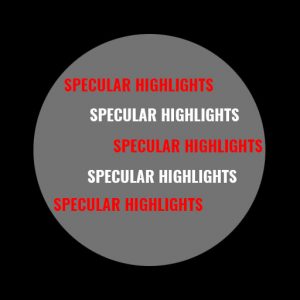
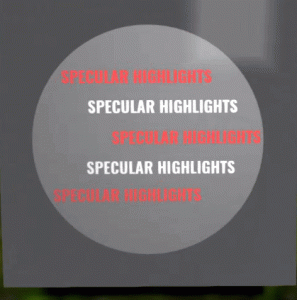
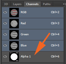
In my own work, the glossy map is applied to the specular map as an alpha channel. Any areas on the alpha channel that are black will mask off the reflectiveness of the object.
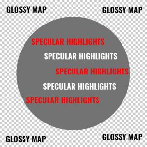
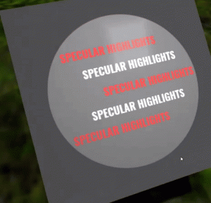
What does this all end up looking like?
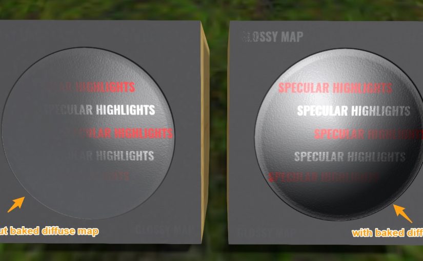
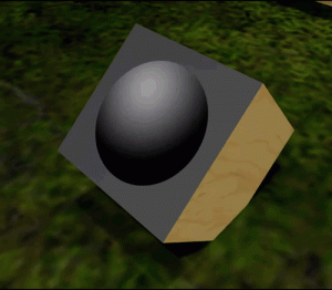
Finally, here’s what all of these texture maps look like, put together.
With the normal map added, the circle now has a bit more dimensionality. We are also able to see how specular highlights become less noticable as the camera moves away from them face-on.
If we add back that simple baked shadow texture from above, we can give this surface even more depth!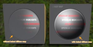
Together, these texture maps have extensive application. You can add iridescence to a Christmas tree ornament, for example, or texture to an elephant’s skin. You can add droplets of water to a leaf or provide a scaly sheen to a dragon’s hide.
Hopefully this provides a good starting-off point for your creations – I’d love to see what you come up with! If you have any questions, please feel free to give me a shout in-world on my main account (Aki Shichiroji) and I’ll be happy to provide feedback or help as necessary.
Hopefully I’ll have more to discuss release-wise, since Candy Faire is imminent! Additionally, there are some other Organica releases in the pipeline. See you next week!
Did you know I have a Patreon account? If you enjoy this content, please consider becoming a Patron! It helps me create more like it and offers a variety of rewards. Alternatively, if you like the sorts of things that I make for Second Life, drop by my Marketplace listing or my in-world stores and check out what I have to offer!
Unless otherwise noted, I (Aki Shichiroji) and this blog are not sponsored in any way. My thoughts are my own and not indicative of endorsement by any associated or discussed product/service/company.
